
Ubiquiti rebrand

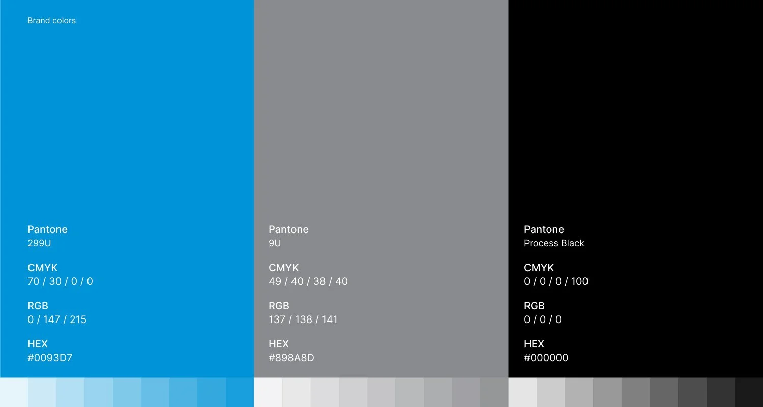
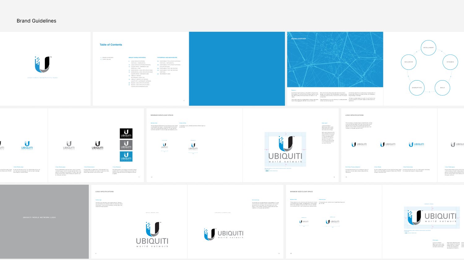
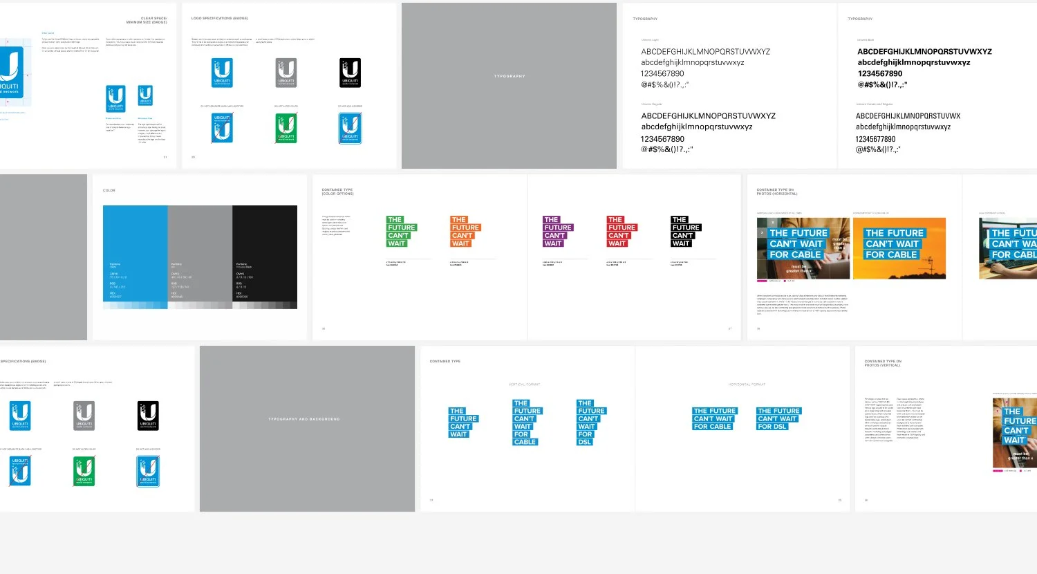
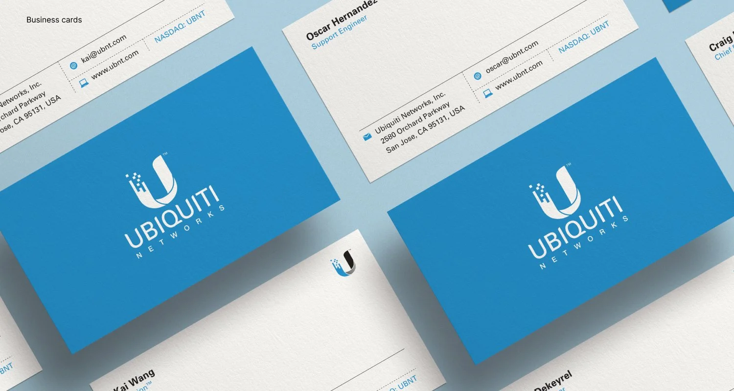


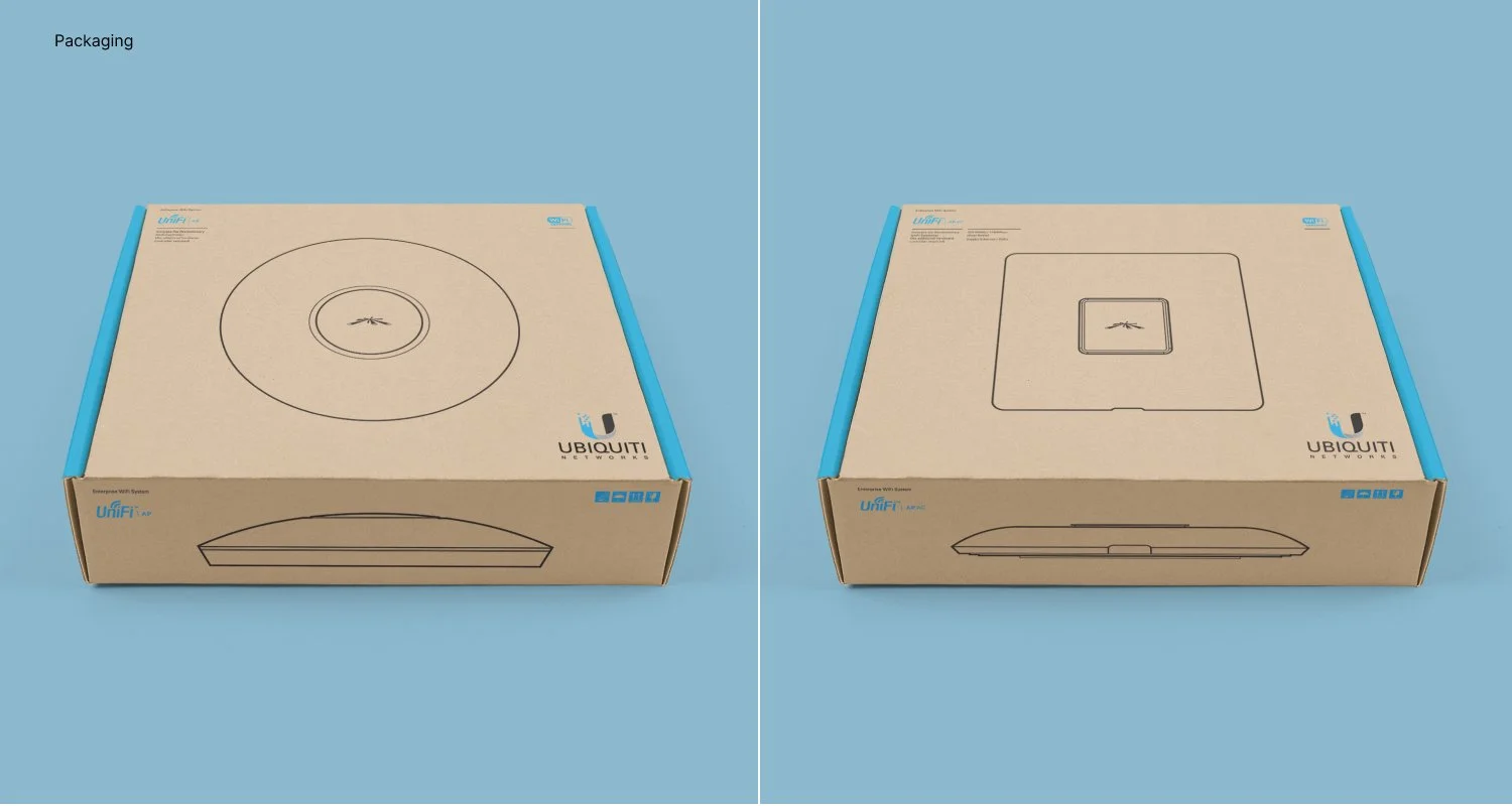
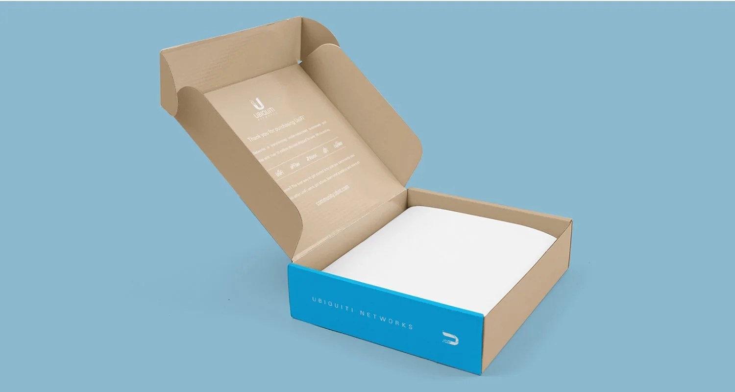
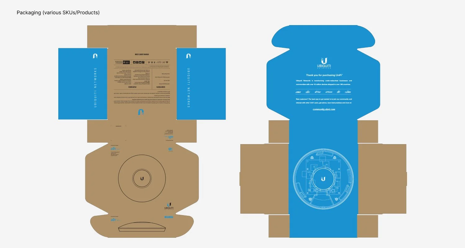
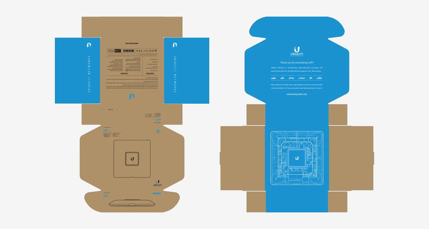
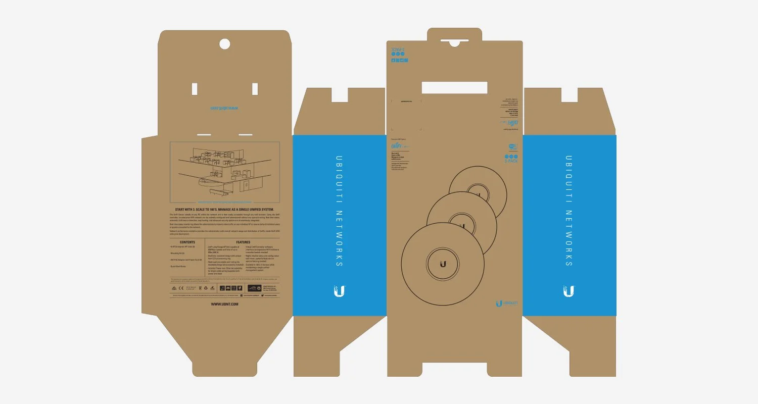
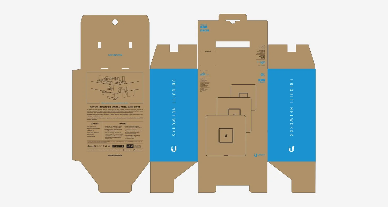
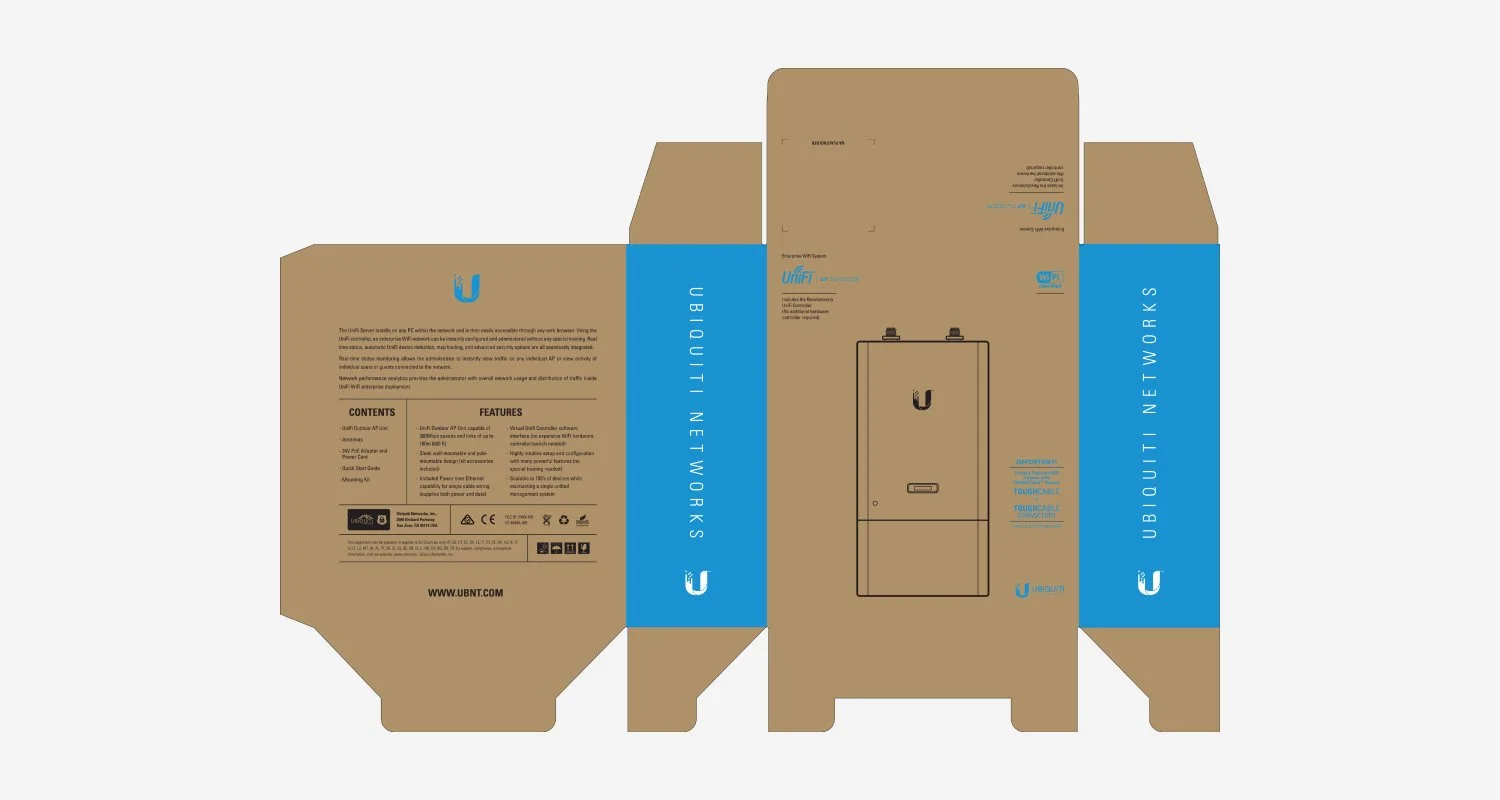

For the Ubiquiti Networks logo redesign, the founder and stakeholders felt it was time for a refreshed brand identity. Through a brand strategy workshop and stakeholder interviews, we identified key themes they wanted the new logo to represent: bold, alliance, fresh, network. The final mark is a clean, modern symbol inspired by the initial “U” in Ubiquiti. The squares appear to come together to form the “U” represent multiple WISPs uniting as one network. We kept the original blue to maintain brand recognition but updated it to a lighter, more vibrant tone. After establishing the logo and lockups, we rolled the new identity out across both print and digital marketing assets. Rebrand was a success as product was introduced to emerging smaller markets, and business increased 78%.
Created at Ubiquiti Neworks / Creative director: John Tso / Senior designer: Ralph Pato
